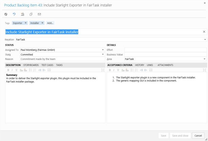
Microsoft shows a new design preview for the Product Backlog Item edit dialog. As usual, Microsoft releases this in Visual Studio Online before it arrives in the on-premise version of the Team Foundation Server. So the software vendor engage users to give feedback on the changes. IMHO it was time to focus on this dialog since the user experience was not that handy. So let’s have a look what Microsoft has done for now. Just for comparison, this is the old dialog:
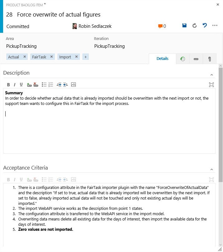
Microsoft keeps all the controls from the old dialog but spends a complete new layout. The result looks like this:
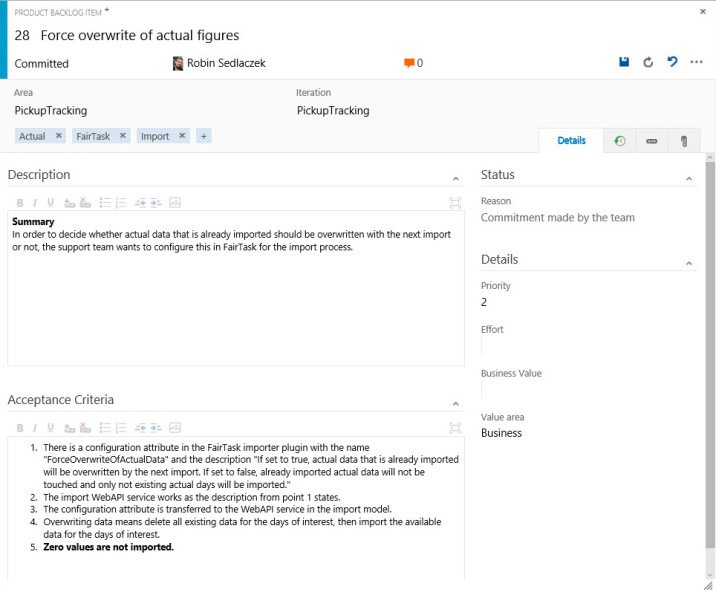
Missing the Status and Details panes? No, the new dialog is more responsive now. So resizing the window or the dialog itself rearranges the controls so that they make efficient use of the available space. Making the dialog wider looks like this:
Changes I like
- Responsive Design.
- Cleaner design, less line, more structure – lets the dialog look fresh and modern.
- Title Bar – Important information is on the top, like the state, which person works in the item, number of comments and link to the discussions, as well as important functions like save, undo, redo etc.
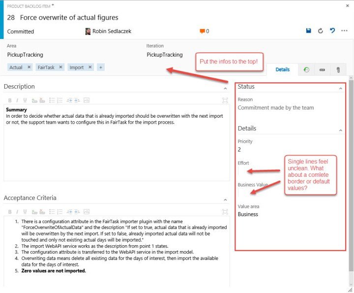
- More Details Pane – More details about the backlog item are shown above the tabbed content. There you find the area, iteration, when and by whom the item was updated the last time and last but not least: the tags.
- Direct Edit – You can change all the details (e.g. assigned person, state, are etc.) with a click. Was the same in the old dialog, but now it feels a bit better.
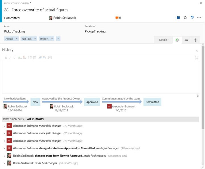
- Tabs – Areas of the dialog are now arranged in tabs. So there is more available space for each area, e.g. for the details, history, links and attachments, because they all have their own tab. Really nice. You can now see more information in one view.
My Suggestions
But there are some points I do not like and some suggestions what I would like to change.
- There is only a single, light gray vertical line that indicates that there is an input control, e.g. for effort, business value and so on. This is a bit confusing and it is not clear that there is an input control. The overall layout feels unclean with that. This is reinforced through empty fields. I would prefer a complete border for input controls or if there are some meaningful default values. Then, as a user, I can see that there is a value I can change.
- One problem of the old dialog was the available space for the description and acceptance criteria. It’s not better now. These fields are not really resized when resizing the window nor I can resize them manually. There is the maximize button for each field, but I don’t like that. Maximizing the fields means that I lose context since all other fields are hidden. I would like to resize those fields manually to my desired size.
- There could be more space for the description text and the acceptance criteria, if the fields from the status pane and from the details pane are put into the header resp. put them above the tabs. And why not? Priority, effort, business value etc. are important values and want to see always (as is for the area iteration etc.). So I would put old the fields from status and details pane to the top. And then there is more space for the other fields.
Fazit
The new design and layout of the PBI edit dialog feels cleaner and modern. But currently there are some functions missing and there is place for improvements. But the overall direction is the right one. What do you think?
| Reference: | Preview of new PBI Edit Dialog from our NCG partner Robin Sedlaczek at the Robin Sedlaczek’s Blog blog. |